Discover the creative process and insights of Graphics Editor Jen Christiansen
| | | Browse any issue of Scientific American, and you'll find captivating infographics, detailed diagrams and colorful charts. These visualizations, crafted from complex datasets, are designed to enhance our feature stories by presenting technical information quickly and clearly. Senior graphics editor Jen Christiansen is the creative force behind these illustrated explainers, but she emphasizes that teamwork is essential to the process. She often works alongside freelance designers and illustrators. And even when she illustrates a concept herself, it's not a solo project.
"I collaborate closely with my colleagues in editorial and the art department to strategize for each article," Jen says. "The graphics themselves are refined through input from the article's author, as well as internal and external reviewers, including fact-checkers and copy editors. Production editors and quality managers also play crucial roles behind the scenes in the newsroom. They ensure that the images print on paper or appear on screen as intended."
Jen has been at Scientific American since 2007—though her history with the magazine dates back to 1996, when she started as an intern. Initially she anticipated a career as an academic research scientist, but she also loved the arts. To stay true to both interests, Jen opted for science communication, specializing in natural science illustration.
For each project, Jen considers what questions the readers might have and how a graphic could help answer those questions. This process involves consulting scientists and other subject matter experts to ensure the accuracy of the information being presented.
"I hope readers gain a deeper understanding of a topic that piques their curiosity or discover excitement for a new subject," she says.
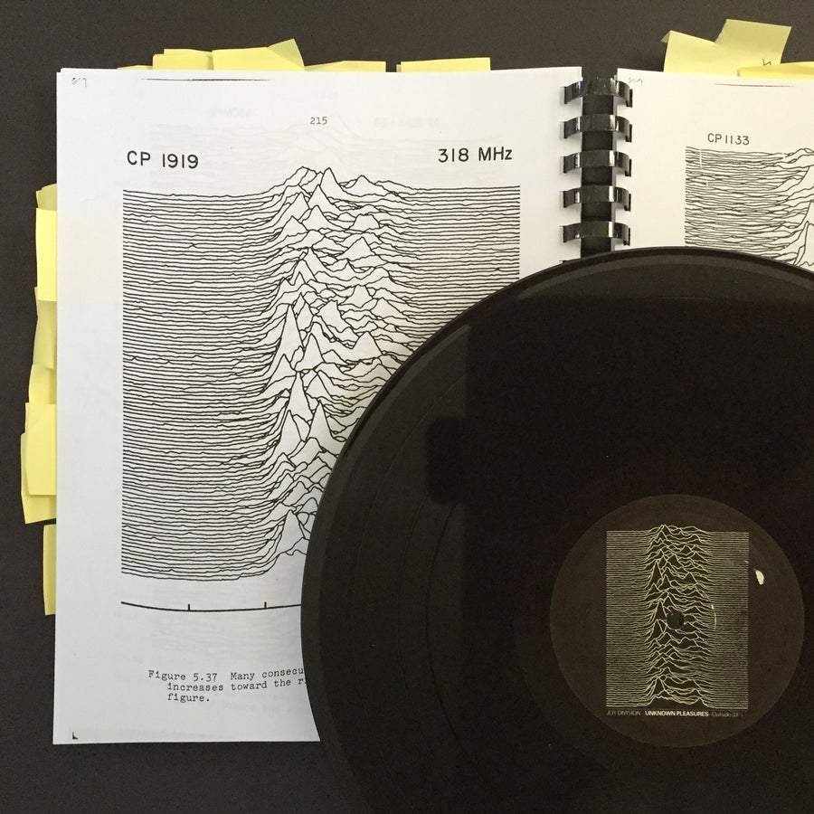
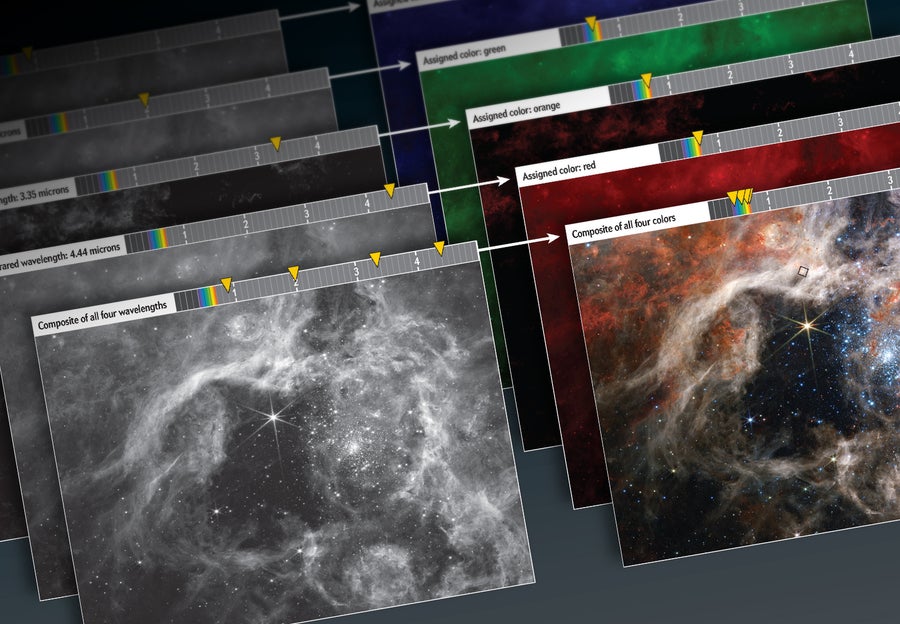
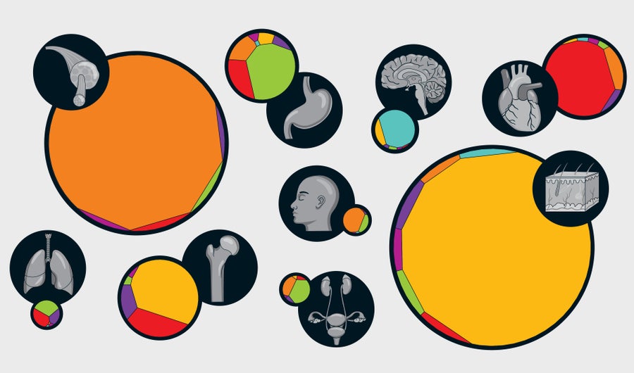
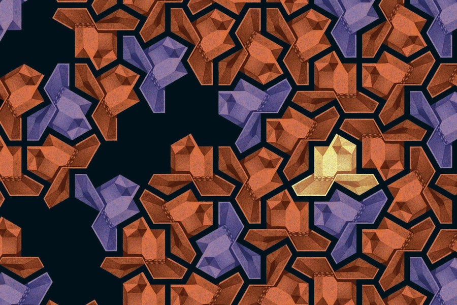
Subscribing to Scientific American helps make Jen's work possible. Right now you can get 60 days of Digital Access for $1. And to learn more about how Jen creates stunning scientific visualizations, read her book Building Science Graphic. | | | | | | | | | Explore some of her most popular graphics: | | | | | | | | | | | | | | | | | |
| | | | | | | Exclusive Deal! | | 60 Days of Digital Access for $1 | | | | | | | | | |  | |
To view this email as a web page, go here.
You received this email because you opted-in to receive email from Scientific American.
To ensure delivery please add graphicseditor@scientificamerican.com to your address book.
Unsubscribe Email Preferences Privacy Policy Contact Us


Comments
Post a Comment